
The Egg.
An intimate conversation.
An entire universe.
Original story by Andy Weir
Visual interpretation by Gerald Broughton · Typography by LikeStyle
PDF · 8 pages · 19 MB
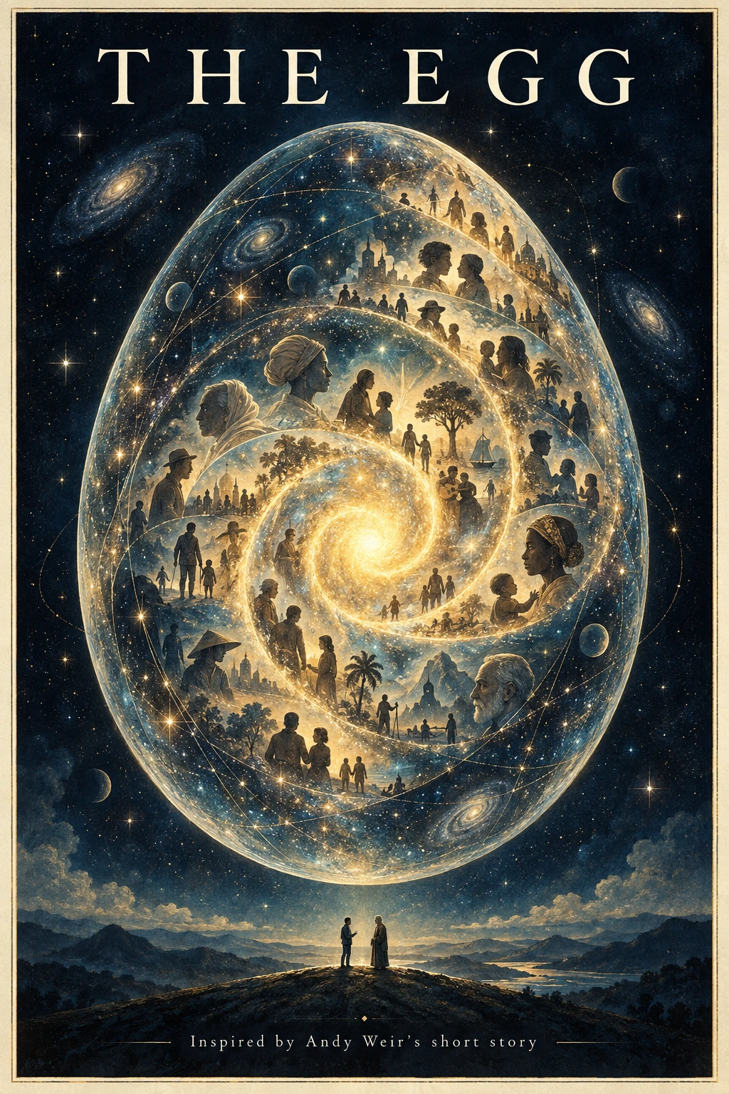
A different way of seeing.
What can an illustrated edition add when the words already do their work?
Look inside the thinkingGive the thought
room to unfold.
A sentence brings us close. Space invites a pause. An image opens the view.
An interactive sketch of the design idea.
A short line gives the conversation its own space.
What can an illustrated edition add when the words already do their work?
This study began with Andy Weir’s The Egg. Its dialogue moves from an intimate encounter toward a much larger idea of identity and shared humanity. The design question was how to give that movement room on the page.
The resulting eight-page edition uses four illustrations, warm ivory reading pages, Baskerville for the dialogue, and Didot for the title. Indigo, teal, and antique gold connect the images. Page turns separate the first encounter, the passage through different lives, and the final revelation.
A sentence can set the pace
The opening sentence stands alone against an immense, quiet scene. Later, a full-page illustration interrupts the reading rhythm without inserting additional narration. At the close, the final words lead into one last image.
These choices interpret the story’s emotional movement. The aim is to invite a pause and let the reader look again.
Type gives the conversation room
Generous leading, short paragraph gaps, and an open right edge give the dialogue space. The story’s words and sequence are preserved. The larger title and restrained credits establish authorship without competing with the reading.
Credits
Original story: The Egg, by Andy Weir.
Visual interpretation: Gerald Broughton.
Typography: LikeStyle.
Inspired by the wonder and humanity of The Egg, by Andy Weir.